Data AnalysisUpdated 2,177 words, 10 minutes
Correlation instability: rates, equities, and the dollar since 2006
Rolling 126-day correlations between the 10-year yield, equities, and the dollar, with a simulation that separates a real regime change from sampling noise.
A correlation computed over twenty years is one number, and it hides what most people want to know: whether the relationship it summarises held still. This article computes the correlations between daily changes in the 10-year Treasury yield, U.S. equities, and the dollar from January 2006 to September 2026, measures how far the rolling version of each travelled, then asks how much of that travel a world with a fixed correlation would have produced anyway. That last step matters, because a rolling correlation wanders on its own even when nothing changes. The dataset, the rolling series, and the script that printed every number are attached. Nothing here is investment advice or a forecast.
What is being correlated, and on which days
Three FRED series, pulled on 2026-09-18 without an API key: DGS10, the 10-year Treasury constant maturity yield in percent; NASDAQCOM, the Nasdaq Composite daily close; and DTWEXBGS, the Federal Reserve's nominal broad dollar index, based at January 2006 equal to 100. The FEDS Note on the revised indexes describes that index as covering "the currencies of 26 economies for which bilateral trade with the United States accounts for at least 0.5 percent of total U.S. bilateral trade", with daily changes computed as "geometrically-weighted averages of changes in bilateral exchange rates".
The equity series is the Nasdaq Composite rather than the S&P 500. FRED's S&P 500 page carries the line "Reproduction of S&P 500 in any form is prohibited except with the prior written permission of S&P Dow Jones Indices LLC", and FRED carries only ten years of daily history for that series, which would have halved the sample. The Nasdaq Composite is copyrighted too: FRED tags it "Copyrighted: Pre-Approval Required", with a copyright notice from NASDAQ OMX Group, so the files attached here carry the returns computed from it and never its closes.
Correction, October 10, 2026: the files attached to this article no longer contain the Nasdaq Composite's daily closes. The raw file carried all 14,022 of them, from 1971 to September 2026, and the headline dataset carried the 5,136 inside the sample. As first published, the paragraph above said the Nasdaq Composite was used instead of the S&P 500 for a licensing reason, which implied its closes could be shipped; they could not. FRED's page for the series, read again on October 10, tags it "Copyrighted: Pre-Approval Required" and its notes read "Copyright © 2016, NASDAQ OMX Group, Inc."; publishing the closes as a downloadable CSV needed a permission we did not have. The index is produced by Nasdaq, Inc. The raw file now holds only the four Federal Reserve series, and the headline dataset keeps r_NASDAQCOM_pct, the daily return computed from the index, which is our own output, now at full precision so that every figure computed from it reproduces exactly. None of the figures changed: we re-ran the script against the new files and every number it prints is the number published here, and the rolling, annual and monthly files it writes are byte for byte the ones already shipped. To rebuild from the index itself, run python code/correlation-instability-rates-equities-dollar.py --download, which pulls NASDAQCOM from FRED, holds it in memory and writes only the returns. FRED keeps the full history back to 1971 and the script ends the sample at 2026-09-11, so a later pull reproduces the published figures; we ran it on October 10 and it printed every one of them.
The three calendars do not agree, so the script works on their intersection: 5,137 dates carry all three series, giving 5,136 daily changes from 2006-01-04 to 2026-09-11, the last date the dollar index had reached when the data was pulled. Within that window DGS10 had 5,178 observations, NASDAQCOM 5,206 and DTWEXBGS 5,188, so between 41 and 69 days were dropped from each. Yields are differenced in percentage points, the two indexes in percent.
The full sample says almost nothing
Over all 5,136 days, the correlations are small and, for one pair, absent:
| pair | correlation | 95% interval |
|---|---|---|
| 10-year yield change vs equity return | +0.248 | +0.222 to +0.274 |
| equity return vs dollar return | -0.273 | -0.298 to -0.247 |
| 10-year yield change vs dollar return | -0.001 | -0.028 to +0.026 |
The intervals are tight because 5,136 observations is a lot. The third row is the one to be careful with: over twenty years the yield and the dollar moved together to no detectable degree at all, which is not the same as saying they never moved together.
The rolling picture
Recomputing each correlation over a trailing 126 observations, about six months of trading days, produces 5,011 windows and a very different impression. The whole rolling series costs one pass, because a Pearson correlation needs only five running sums:
def rolling_corr(xs, ys, window):
    out = [None] * len(xs)
    sx = sy = sxx = syy = sxy = 0.0
    for i, (x, y) in enumerate(zip(xs, ys)):
        sx += x; sy += y; sxx += x * x; syy += y * y; sxy += x * y
        if i >= window:                      # drop the observation leaving the window
            a, b = xs[i - window], ys[i - window]
            sx -= a; sy -= b; sxx -= a * a; syy -= b * b; sxy -= a * b
        if i >= window - 1:
            n = window
            den = math.sqrt((n * sxx - sx * sx) * (n * syy - sy * sy))
            out[i] = (n * sxy - sx * sy) / den if den else None
    return out
| pair | mean | sd | lowest | highest | range | negative windows |
|---|---|---|---|---|---|---|
| yield vs equity | +0.246 | 0.273 | -0.529 (2026-09-04) | +0.692 (2012-03-06) | 1.222 | 1,004 of 5,011 (20.0%) |
| equity vs dollar | -0.246 | 0.192 | -0.694 (2012-04-24) | +0.255 (2008-08-28) | 0.949 | 4,401 of 5,011 (87.8%) |
| yield vs dollar | +0.033 | 0.276 | -0.640 (2012-03-09) | +0.556 (2017-01-23) | 1.197 | 2,384 of 5,011 (47.6%) |
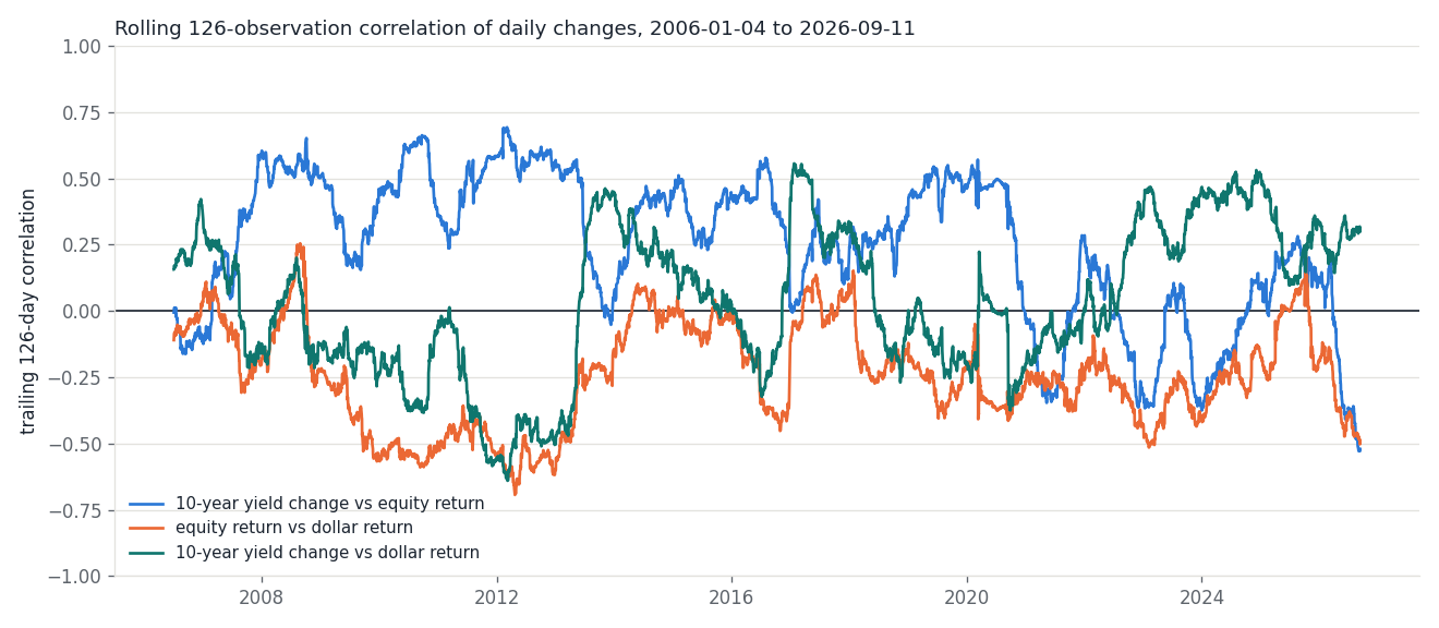
The stock-bond pair spent most of 2007 to 2020 clearly positive, reaching +0.692 in March 2012, then turned over: its three longest unbroken negative stretches are 265 windows from 2023-09-18 to 2024-10-08, 204 from 2022-07-25 to 2023-05-17, and 203 from 2020-12-28 to 2021-10-19. In the final window, ending 2026-09-11, it sits at -0.521, and the full-sample figure of +0.248 does not describe that window.
The yield-dollar pair shows more sharply what a long-run correlation can conceal. Its twenty-year value is -0.001, and its rolling version ran from -0.640 in March 2012 to +0.556 in January 2017. A correlation of zero here averages two opposite regimes rather than recording an absence of relationship.
How much of that is noise
A rolling correlation moves for two reasons: the relationship changes, or the window catches an unrepresentative draw. The second is larger than most readers expect. With 126 observations, a sample correlation of exactly zero carries a 95% interval of -0.175 to +0.175, and a sample value of +0.40 carries +0.242 to +0.537. Two windows reading +0.10 and +0.40 are not in conflict.
To size that, the script simulates worlds where the correlation never changes: for each pair it draws 1,500 paths of 5,136 bivariate normal pairs with the correlation fixed at the full-sample value, runs the same rolling calculation over each, and records how far the rolling series travelled.
| pair | fixed correlation | median simulated range | 95th percentile | largest of 1,500 | observed range |
|---|---|---|---|---|---|
| yield vs equity | +0.248 | 0.476 | 0.569 | 0.703 | 1.222 |
| equity vs dollar | -0.273 | 0.467 | 0.560 | 0.719 | 0.949 |
| yield vs dollar | -0.001 | 0.504 | 0.599 | 0.743 | 1.197 |
Two things follow. First, roughly half the observed swing is what a constant correlation does by itself: a fixed relationship of +0.248 still produces rolling correlations spanning about 0.48 over a sample this long, and more than 0.57 in 5% of runs. Anyone reading meaning into a rolling correlation that moved from +0.20 to +0.50 is usually reading noise. Second, the observed ranges are still far outside that distribution: none of the 1,500 paths reached the observed range for any pair. For the stock-bond pair the simulated extremes stay inside -0.079 to +0.527 in 90% of runs, against an observed -0.529 to +0.692, and a constant-correlation path crossed zero a median of 2 times against 42 crossings in the data.
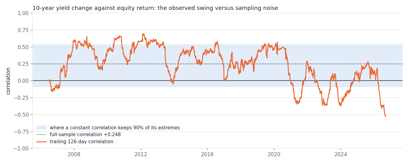
The test is deliberately crude. Real daily changes are not normal and their volatility clusters, both of which make rolling correlations wander more than this simulation allows, so the true noise band is wider than the shaded one. The result establishes the direction of the comparison, not a p-value worth quoting.
Year by year, and horizon by horizon
The calendar-year table shows where the movement sits. The stock-bond correlation ran between +0.255 and +0.562 every year from 2007 to 2020 except 2013, then went negative in 2021 through 2024, returned to +0.193 in 2025, and stands at -0.382 across the 174 trading days of 2026 so far.
| year | yield-equity | equity-dollar | yield-dollar |
|---|---|---|---|
| 2008 | +0.495 | -0.175 | -0.066 |
| 2011 | +0.562 | -0.512 | -0.479 |
| 2017 | +0.257 | +0.071 | +0.325 |
| 2020 | +0.393 | -0.342 | -0.061 |
| 2021 | -0.028 | -0.247 | -0.051 |
| 2022 | -0.168 | -0.350 | +0.240 |
| 2023 | -0.117 | -0.346 | +0.339 |
| 2024 | -0.027 | -0.197 | +0.483 |
| 2025 | +0.193 | -0.034 | +0.169 |
| 2026 | -0.382 | -0.409 | +0.271 |
Every year is in -annual.csv; the rows above are a selection. The article does not test any explanation for the 2021 change of sign, and the data here cannot supply one.
The measurement horizon is a second source of disagreement, and it is often mistaken for instability. Recomputing the same period on weekly and month-end changes:
| horizon | observations | yield-equity | equity-dollar | yield-dollar |
|---|---|---|---|---|
| daily | 5,136 | +0.248 | -0.273 | -0.001 |
| weekly | 1,079 | +0.212 | -0.458 | +0.036 |
| monthly | 248 | +0.074 | -0.526 | +0.077 |
The stock-bond correlation weakens as the horizon lengthens, from +0.248 daily to +0.074 monthly, while the equity-dollar correlation nearly doubles, from -0.273 to -0.526. Two analysts quoting different numbers for the same period and the same series may simply have differenced at different frequencies.
A check on the method
Averaging daily values is the operation underneath all of this, so it is worth confirming against something published. H.15 states that "Weekly, monthly and annual rates are averages of business days unless otherwise noted", and the monthly series GS10 carries the note "Averages of business days". Averaging the DGS10 observations within each month should therefore reproduce GS10 exactly.
It does. Across all 776 months from January 1962 to August 2026, the average of the daily business-day values, rounded half up, equals the published monthly figure to both decimals, with no exceptions. The comparison runs in integer units of the last published decimal so that no floating-point rounding can decide the answer; 15 of those months average to exactly half a unit, where Python's built-in round rounds to even and the published series rounds away from zero, which is the only reason a naive version of this check fails on seven of them.
The same test on the dollar index probes something the source pages do not state: neither the H.10 summary page nor the FRED page for TWEXBGSMTH says how the monthly index relates to the daily one. Averaging DTWEXBGS by month reproduces the published value to all four decimals in 234 of 248 months, and the other 14 are each one unit in the last decimal. That is close enough to identify the rule and not close enough to call it exact; the residue is consistent with the monthly figure being computed from unrounded daily values while FRED publishes the daily index rounded to four decimals, though we found no source stating that.
The files, and the limits
datasets/correlation-instability-rates-equities-dollar-raw.csv is the raw pull of the four Federal Reserve series, 17,210 dates, each as FRED served it with "." rendered as an empty cell; nothing from the Nasdaq is in it. The headline dataset has 5,136 rows of aligned daily changes: date, the yield and the dollar index level, and d_DGS10_pp, r_NASDAQCOM_pct, r_DTWEXBGS_pct, the Nasdaq return at full precision because every correlation involving the Nasdaq is computed from it. -rolling.csv holds 5,011 rows of rolling correlations, -annual.csv 21 rows by calendar year, and -monthly.csv 1,024 rows of the method check, its difference column in units of the last published decimal. Run python code/correlation-instability-rates-equities-dollar.py --download --figures to rebuild all of it from FRED: the script holds the Nasdaq Composite in memory, writes only its returns, and ends the sample at 2026-09-11 so that a later pull reproduces these figures. Without --download it recomputes every figure from the attached files, apart from the count of Nasdaq closes in the window, which needs the index's own calendar and is quoted from the September 18 pull. The numbers need only the standard library, the charts matplotlib 3.10.9.
One practical note for anyone pulling FRED this way: the public CSV endpoint stalls and then times out if the request carries no Accept header, which is exactly what urllib sends by default. Adding Accept: */* returns the same file in under a second.
The limits are worth stating plainly. Pearson correlation measures linear co-movement and is sensitive to a handful of large days, which is where much of the co-movement in a crisis lives. The 126-day window is a choice: a 63-day window would swing more and a 252-day window less, and the shape of every chart above depends on it. Correlation says nothing about direction of influence, and none of these pairs is examined here for one. The sample begins in 2006 because the broad dollar index does, which gives the financial crisis an outsized role in any full-sample figure. And a measured change in a correlation describes a past window, not a property that can be assumed to hold in the next one.